- Submissions

Full Text
Environmental Analysis & Ecology Studies
Solar Cycles Control Earth Temperatures Past, Present and Future
DE Nierode Ph. D*
Mechanical Engineering, University of Wisconsin, USA
*Corresponding author:DE Nierode Ph. D, Mechanical Engineering, University of Wisconsin, USA
Submission: February 06, 2024; Published: March 12, 2024

ISSN 2578-0336 Volume122 Issue1
Abstract
Three nominal solar cycles of 1000, 70 and 11 years control the increasing annual temperatures of the Earth measured since 1850. The model that closely fits these measured Earth temperatures is the Solar Cycle Model (SCM). The SCM is the culmination of prior work [1,2] to quantify information presented by Singer & Avery [3] in their provocative book UNSTOPPABLE GLOBAL WARMING-Every 1,500 years. The authors discuss seven diverse scientific studies ranging from ice cores to fossilized pollen [4] that all demonstrate effective thermal cycles from hot to cold every nominal 1,500 years (1,500 yrs.±500 yrs.). The SCM also models the Earth’s past, historically documented temperature epochs. The SCM is an alternative to the United Nations Intergovernmental Panel on Climate Change (UNIPCC) AR5 [5] and AR6 [6] models which consider human-caused greenhouse gas accumulation into the upper atmosphere as the primary cause of this warming. The UNIPCC models do not accurately model measured Earth temperatures and more recent models may be even less trustworthy [7]. Both the SCM and UNIPCC models predict that Earth temperatures currently will continue increasing. SCM predicts that Earth temperatures will increase a total of 1.75deg. C. from 1850 until the year 2232 when maximum temperature will be 15.39deg. C. which afterward will decline toward the next little ice age. The UNIPCC model predicts increasing temperatures until greenhouse gases stabilize with added gases exactly balancing removed gases (net zero). Earth temperature would then remain at the last level unless total greenhouse gasses decrease, or other changes are made to reduce net solar irradiation arriving at the Earth’s surface. The SCM uses measured Earth temperatures from 1850 to 2020 as its input data and therefore any greenhouse gas effects over that time span are already present within the model. The SCM model found that measured Earth temperatures themselves exhibit a 73-year secondary solar cycle in addition to a primary 1,071 year solar cycle that fits the timing of prior historical temperature epochs like the Little Ice Age and Medieval Warming. A third solar cycle of 11 years was incorporated to clarify understanding of several Earth Science correlations as they relate to the SCM. After the SCM was completed it was found to agree quite closely with Earth Science correlations including Sunspots, the Atlantic Multidecadal Oscillation, the Power Dissipation Index, the Accumulated Cyclone Energy Index, the Pacific Decadal Oscillation, and the El Niño Southern Oscillation. The trends in these data sets are mirrored very closely by the SCM. The SCM predicts that La Niña in the Southern Pacific Ocean will dominate 60% of the time during the next two decades and Atlantic hurricanes will be less energetic while all the other correlations studied will decline for the next two decades. Currently increasing temperatures on Earth are part of its natural temperature cycle that has been occurring for as long as the last 15,000 years.
Keywords:Climate modeling; Solar cycles; Earth temperatures; Global warming; Climate change; Hurricane strength
Comparison of the UNIPCC and SCM Earth Temperature Models
Figures 1 & 2 show a comparison of two models versus reported Earth temperatures since 1850. The UNIPCC AR5 model [5] released in 2014 in Figure 1 is a computer simulation that divides the Earth’s surface and atmosphere into three dimensional volumes that are time stepped forward as phenomenological changes are known to have occurred such as volcanic eruptions, excessive rains, deforestation and other documented factors. Figure 1 indicates where the model deviates most significantly from Earth temperatures during the three timespans highlighted. The measured temperatures used at that time [8] were an average of five calculated profiles. The UNIPCC AR5 model significantly overpredicts Earth temperatures in the three intervals and overpredicts nearly everywhere else to a lesser extent. The Hiatus [9] interval from 1998 to 2014 is an especially bad fit for the model. When differences like these occur in a model, changes to the model are needed to achieve much better agreement [10]. The UNIPCC AR5 model was issued in 2014 and has been updated by the AR6 model in 2020. Until there is much closer agreement between the models and measured Earth temperatures the UNIPCC models are unproven.
Figure 1:UNIPCC model fit to measured earth temperatures since 1850.
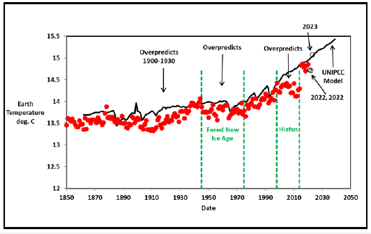
Figure 2:Solar cycle model fit to measured earth temperatures since 1850.
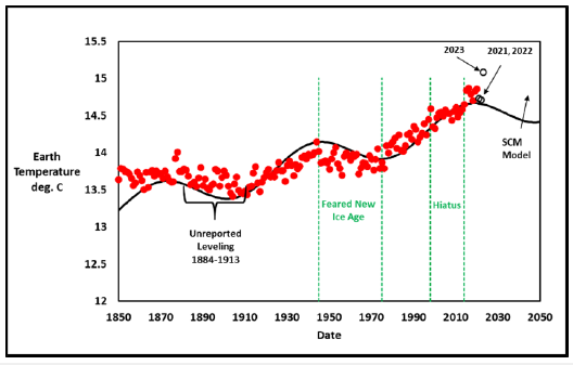
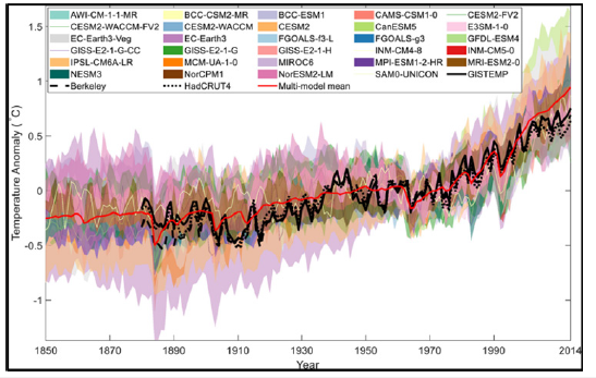
The SCM in Figure 2 illustrates the cyclic nature of the temperature data itself and leads to the prediction that beyond the Hiatus Earth temperatures will moderate until the next cyclical increase. It should be noted that the two models used different measured temperature data sets. This situation with no single set of measured Earth temperature values is further discussed in the section titled Questionable Recalculated Earth Temperatures Since the Start of the Hiatus. Note that the 2023 Earth temperature in both images is the maximum ever reported since 1850 and agrees with the UNIPCC model. From 1850 to 2022 Earth temperatures rose 1.07deg. C. while from 1850 to 2023 Earth temperatures rose 1.31deg. C. for a 22% increase in 2023! Is this value real or is it due to the new temperature calculation method changes discussed in the section titled Questionable Recalculated Earth Temperatures Since the Start of the Hiatus. The SCM predicts moderating temperatures during the next two decades while the UNIPCC model predicts them increasing in a straight line. AR6 modeling results are shown in Figure 3 which is Figure 1 from an open research paper [11]. The multi-model mean red line is the average of about thirty models run by various entities while the black line is average Earth temperatures from NASA [12]. The spread in the different models is large. All UNIPCC mean models are the average of many models as in Figure 3 after the results have been adjusted to the baseline [13] from 1961-1990. In other words, the average model results are adjusted up or down to agree with the timespan from 1961-1990. The level of agreement here looks better than AR5 in Figure 2, but improvement appears to be mainly due to elevated recalculated Earth temperatures. In both cases the mean models do not account for the detailed shape of the temperature curve. Questionable changes in Earth temperature calculations will be discussed in the section titled Questionable Recalculated Earth Temperatures Since the Start of the Hiatus.
Figure 3:UNIPCC AR6 models.
The Solar Cycle Model of Earth Temperatures
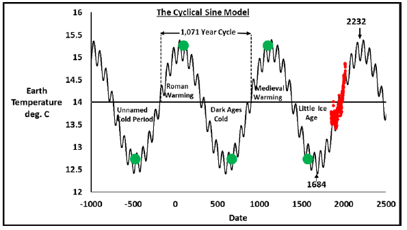
The average annual temperatures of the Earth since 1850 from HadCRUT5 [14] were fit by nonlinear regression of the SCM parameters to Earth temperatures through 2020 with the detailed fit [1] shown in Figure 4. Red points are the HadCRUT5 calculated annual temperature values while the green points are maximum and minimum temperature estimates located at the historical midpoints of the various temperature epochs reported by historians [15]. The SCM assumes that the Earth has experienced the same temperature cycles for about the last 3,000 years during these past historical temperature epochs and will continue. The validity of this assumption will be determined by future Earth temperature measurements and a look back at long ago reported thermal phenomena. The SCM fit found a major solar cyclicity of every 1,071 years in close agreement with a known solar cycle of about 1,000 years [16]. The SCM also found a secondary cycle of 73 years within the measured temperatures that agrees with a known solar cycle of about 70 years [17]. A third cycle of about 11 years known as the Schwabe [18] sunspot cycle was not part of the SCM fit but will be seen to be particularly important to explain the cause of the 73-year cycle. The SCM fits these measured Earth temperatures and aligns with the last five historical epochs where unusually hot and cold timespans occurred on Earth.
Figure 4:Measured earth temperature data compared to the solar cycle model.
The solar cycle model down dips and upswings
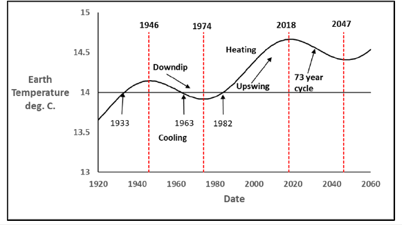
A particularly important aspect of the SCM is the 73-year temperature cycles that oscillate between a “downdip” with slight cooling followed by an “upswing” with increased heating as shown in Figure 5. The last prior downdip was between 1946 and 1974 and the most recent upswing was between 1974 and 2018. We are now in a downdip region that began in 2018 and according to the SCM will continue until 2047. Overall Earth temperatures continue to increase toward the next maximum while these down dips and upswings continue along that path. The SCM in Figure 4 predicts that for the next 200 years temperatures will continue an overall increase following the 1,071 and 73-year cyclicities to the next maximum Earth temperature in 2232. The SCM quantifies the three time spans in Figure 1 when Earth temperatures leveled in the past. The Hiatus is an expected part of the SCM. It will be shown later that these time spans are due to the 73-year cyclicity. For the next 200 years increasing Earth temperatures will be calculated and some will be reported as the “highest measured temperatures ever”. This is a natural result of the SCM.
Figure 5:Downdips and upswings in the solar cycle model.
As the next maximum temperature is approached, just like during the Medieval Warming of the past, populations will move away from the equator toward cooler climes. Food sources will change locations and unless sufficient energy is available to cool everywhere, living will be difficult. Earth temperature today is equivalently at the point of the year 985 when Viking Eric the Red [19] moved his tribe from Northern Europe and discovered the utopian land of Greenland where lush, warm grasslands fed his livestock until about 1350 when excessive cold and ice (the beginning of the Little Ice Age) caused its subsequent abandonment. The observed melting of Greenland glaciers now [20] should continue for the next 200 years according to the SCM. Similarly, when our next Little Ice Age occurs the Thames River in London, England should freeze over [21] often so that Ice Fairs can be held on it. The next sections show the close agreement of Earth science correlations with the SCM.
SCM Comparison to Earth Science Correlations
The following Earth science correlations have been monitored for decades or centuries. These correlations are in remarkably close agreement with the SCM. None were used to develop the SCM. All comparisons were made afterward.
Sunspot data
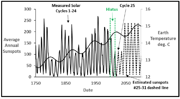
Figure 6 shows distinctly similar trends [1] between Schwabe 11-year sunspot data [22] from 1749-2022 and the SCM. The number of sunspots observed on the surface of the sun has been counted continually since 1749 with substantial number of spots termed maxima and small numbers, minima. It is well known that sunspot maxima cause slightly increased solar irradiation while minima experience slightly reduced irradiation [23,24] on Earth. It is seen that during an SCM upswing sunspot maxima occur with increased solar irradiation that warms the Earth. During a SCM downdip sunspot minima reduce solar irradiation causing slight Earth cooling. Even though the difference in irradiation between sunspot maxima and minima has been measured to be as little as 0.15% [25], that difference over 20 or 30 years with several minima or maxima in a row leads to a significant heat flux difference. Sunspot data and the SCM agree very well.
However, note that during the time of the Hiatus [8] from 1998 to 2013 sunspot cycle 24 was a minima rather than the SCM’s expected maxima. This minima cooled the Earth causing the Hiatus. In the future the SCM predicts that sunspot cycles 25 and 26 will be minima resulting in more Earth cooling. After that the next 5 cycles will be maxima resulting in more heating. NASA also has predicted that sunspot 25 will be a minima [26] though that prediction may be changing [12]. The discrepancy during the Hiatus suggests that it is really sunspot cyclicity that controls the SCM upswings and down dips as has been proposed [27], not just sunspot numbers alone. A model for the SCM inferred 73-year solar cycle controlled by sunspot cyclicity alone may be the next step to better quantify Earth temperatures. This work is under way.
Figure 6:Measured sunspot data compared to the solar cycle model.
The Atlantic multidecadal oscillation
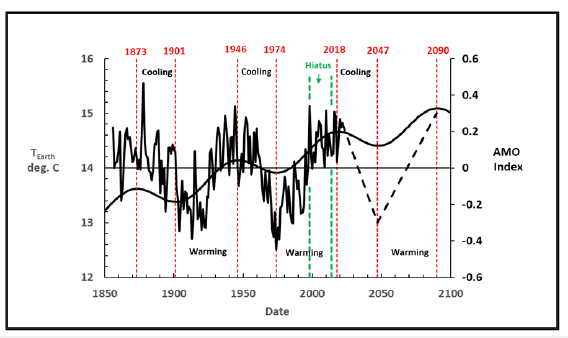
Figure 7 shows the SCM 73-year cycle plotted [1] with the measured Atlantic Multidecadal Oscillation (AMO) temperature data [28] where Atlantic Ocean temperature variations have been measured since 1855. The AMO declines when the SCM has a downdip and the AMO increases during an SCM upswing. Both happened during the 73-year solar cycle with the probable cause being sunspots. This cyclicity agrees with the observation of 60-80 year cycles [29] in these data. The SCM predicts that the AMO will decline until 2047 after which it will increase. The SCM and AMO trends agree exceptionally well.
Figure 7:Atlantic multidecadal oscillation compared to the solar cycle model.
North Atlantic ocean hurricane strengths, ACE and PDI
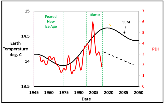
The strength of hurricanes during their annual seasons from June through November in the North Atlantic Ocean are monitored to determine if there are trends that may be indicators of climate change or global warming. The two dominant strength parameters are the Accumulated Cyclone Energy (ACE) and the Power Dissipation Index (PDI). Both calculate the amount of energy these hurricanes or cyclones represent. ACE data [30] compared to the SCM is shown in Figure 8. The cyclicity of the ACE index correlates with SCM down dips resulting in lower energies as temperatures somewhat decrease and higher energy levels during upswings when temperatures increase. SCM predicts that for the next two decades ACE hurricane strengths will continue to decline along with AMO. The PDI [31] parameter shows a similar agreement in Figure 9 with decreases and increases in the PDI correlating with the SCM down dips and upswings. SCM predicts that the PDI will also decline during the next two decades due to the current SCM downdip. SCM predicts that ACE and PDI will both decrease for the next two decades resulting in lower cumulative hurricane strengths.
Figure 8:ACE hurricane power index compared to the solar cycle model.
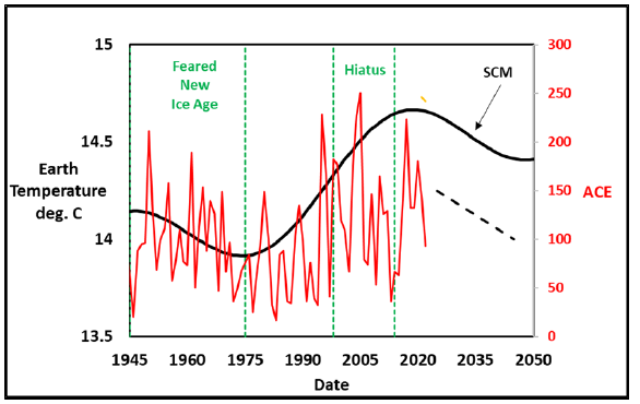
Figure 9:PDI hurricane power index compared to the solar cycle model.
The Atlantic meridional overturning oscillation
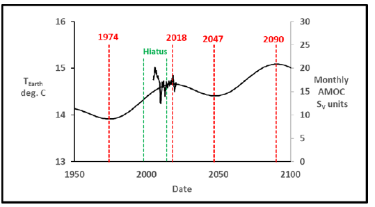
Another Atlantic Ocean phenomenon [32] is the Atlantic Meridional Overturning Circulation (AMOC). AMOC is like a giant conveyor belt where warm water from the tropics moves on the surface toward Labrador where it becomes cold, sinks to the bottom, and then returns to the tropics at depth. It moves from the tropics to the Arctic. AMOC flow rates have been measured only since 2004 which does not cover a complete SCM upswing or downdip cycle and therefore no correlation with the SCM can be evaluated. Figure 10 shows monthly measured values [33] compared to the SCM. The AMOC is now at the point of transition to an SCM downdip where different behavior might be expected. The apparent close agreement with the SCM at this point is only due to the scale selected for the AMOC data. The next two decades of data will be needed to draw any substantive conclusions. The near-term collapse of the AMOC is currently under discussion [34] due to expected future ocean warming and salinity reduction from melting glaciers. The SCM predicts moderate AMO Earth cooling during the current downdip which may help reduce the likelihood of AMOC collapse. Earth temperatures for the next two decades should look like the intervals from 1884-1913 and 1945-1975 in Figure 2 with little temperature increase. The AMOC data for the next two decades should be highly informative for both AMOC understanding and SCM utility.
Figure 10:Atlantic multidecadal oscillation compared to the solar cycle model.
The Pacific decadal oscillation
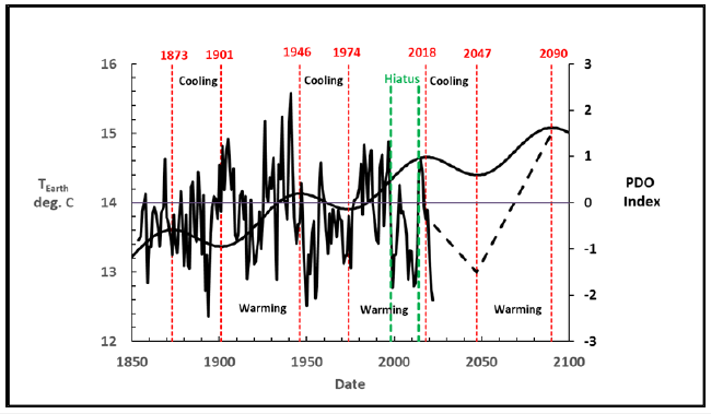
Figure 11 shows a similar comparison [1] between the Pacific Decadal Oscillation (PDO) data [35] and the SCM. The PDO is also predicted through this comparison to continue to decline through 2047 and increase thereafter. Noted PDO “phase inversions” [36,37] are clearly seen at 1946 and 1974 in close agreement with the SCM down dips and upswings. Note the additional phase inversion about the year 2000 when the PDO data diverge from the SCM upswing. This is another response to sunspot cycle 24 being a minima and causing the Hiatus.
Figure 11:Pacific decadal oscillation compared to the solar cycle model.
The El Niño Southern Oscillation (ENSO)
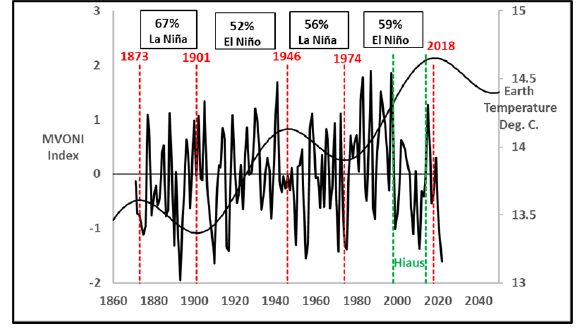
There are multiple presentations of ENSO data including the Multivariate Ocean Niño Index (MVONI) [38] and the Ocean Niño Index (ONI) [39]. The MVONI is the most complete as it includes both ocean water temperature variations as well as atmospheric pressure effects. These plots versus time have positive index values for El Niño events and negative for La Niña events. To compare these plots to the SCM down dips and upswings, one can do numerical integration of the data during a downdip or upswing intervals to see whether El Niño or La Niña dominates. During an SCM downdip with cooling the plots should have a negative numerical integral indicating La Niña dominance. During an upswing heating should result in a positive numerical integral indicating El Niño dominance. These integrals are in effect measures of the net energy content during the various timespans. Figure 12 shows the integral results for the monthly MVONI index. SCM down dips have MVONI integrals resulting in La Niña domination of 67% and 56% during the last two down dips. The upswings have MVONI integrals resulting in 52% and 59% domination by El Niño. The results agree with the SCM trends. This agreement predicts for the future that the downdip from 2018-2047 will be roughly a 60% La Niña domination with more cooling than heating. Note the dramatic response to minima sunspot 24 at the start of the Hiatus.
Figure 12:Multivariate ONI index compared to the solar cycle model.
When the monthly 3.4 ONI Index is plotted in the same way to evaluate the numerical integral, the result is shown in Figure 13. Only the upswing from 1974-2018 has a complete data set. The SCM predicts 1974-2018 should have been positive with El Niño in control yet the result is only 50% El Niño. The Hiatus and sunspot 24 may account for this difference. Both Figure 12 & 13 show a large decline at the beginning of the Hiatus. The ENSO data agree well with the SCM trends, and sunspot cycles are the probable cause of this agreement. The SCM view of ENSO may help resolve some complications with climate projections [40] in the Southern Pacific Ocean with other computer climate models. Table 1 summarizes the calculations with the individual positive and negative numerical integrals in Figure 12 & 13. Down dips are La Niña dominated while upswings are El Niño dominated. It is interesting to note that during the first five years of our current downdip there is 90% La Niña domination. The first five years of the prior downdip from 1946-1950 show a similar, large early response of 75% for La Niña domination. The information in this paper leads to the conclusion that for the current downdip SCM temperature cycle until 2047 ENSO in the Pacific Ocean will experience about a 60% domination by La Niña with lesser El Niño during shorter timespans and Atlantic Ocean hurricanes will be of lessor strength. Earth temperatures will also decline during that time span as will the AMO, PDO, MVONI, and 3.4 ONI indices. The near term response of the AMOC to moderating ocean temperatures may improve its stability. Measured Earth temperatures in the next two decades will determine the validity of these predictions.
Figure 13:ONI index compared to the solar cycle model.
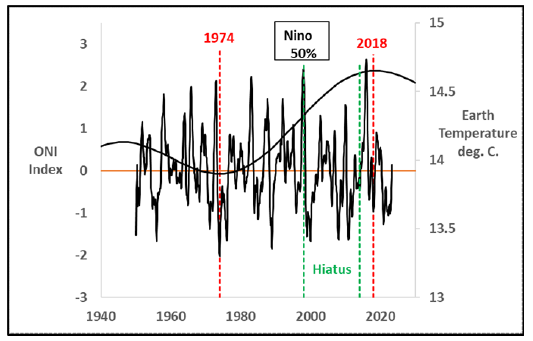
Table 1:MVONI and ONI Integrals. *First five years at the start of a downdip.

Past Earth Temperature Phenomena Before 1749
It is evident in Figure 4 that the SCM fits measured Earth temperatures (171 values) and coincides with the past five historical epochs (5 midpoint dates) where there were no Earth temperature measurements. The SCM also agrees well with the Earth science correlations presented in the section titled SCM Comparison to Earth Science Correlations. But does the SCM have any supporting scientific data from Earth happenings prior to 1749? Yes, the following five examples show SCM support from as long ago as 15,000 years.
Maunder minimum
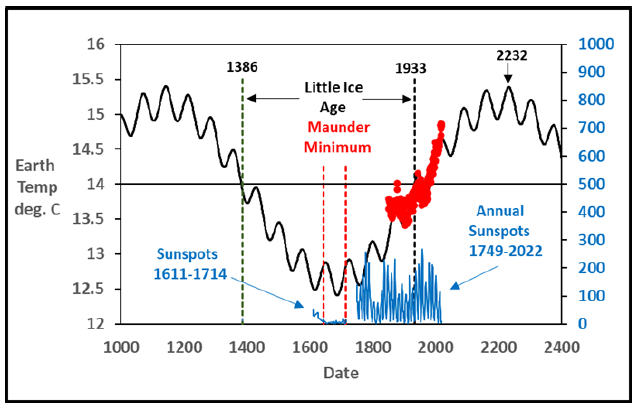
Figure 14 shows that the observed Maunder sunspot minimum [23,24] occurred exactly where the SCM predicts a minimum Earth temperature-the coldest point in the Little Ice Age [41,42]. Low sunspot numbers are known to result in reduced solar irradiation [23] and unusually low values occurred right at an SCM predicted minimum Earth temperature. Lower solar irradiance is known to have an additional factor [25] of ozone chemistry changes that enhances the overall effect. The more rigorously documented sunspot data from 1749-2022 shown in Figure 14 have already been discussed in Figure 6.
Figure 14:Earliest sunspot data coincide with the maunder minimum.
Reconstructed sunspots over past 11,400 years
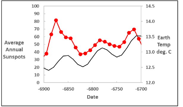
In addition to the monthly counted sunspots since 1749 estimated sunspot data from dendrochronologically dated radiocarbon concentrations [43] from as long ago as 11,400BP are shown in images 15 & 16. The data [44] compared to the full SCM in Figure 15 does not show any obvious correlation as expected. These estimated sunspots are decadal, not monthly/annual, so they may not be presentative of the usual 11-year Schwabe cycles. There is an apparent cyclicity in the data of about 6,000 years in Figure 16 without current meaning in the SCM. However, these data over shorter timespans of two to three hundred years show a clear 73-year SCM correlation. The Figs. 17-22 summarize this agreement. The comparison shows that the slopes of the sunspot data correlate with the slopes of the SCM downdips and upswings. Figure 17 shows the overlap between the annual Schwabe [18] data since 1749 (same as in Figure 6) and the decadal data which ends in 1895. Both have peaks and valleys at the same time as the SCM though their magnitudes are different. The agreement between these two sources of effective sunspots is excellent. images 18-22 also show good correlations until 6900BC. Data beyond that point to the end of the data at 9455BC show too much scatter.
Figure 15:Radiocarbon sunspot data.
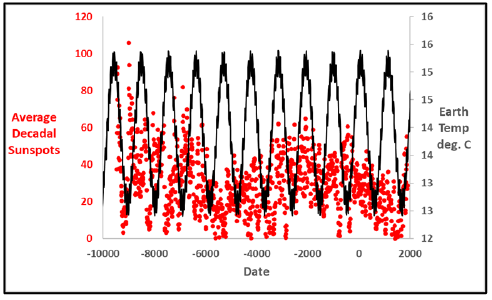
Figure 16:Radiocarbon sunspot data.
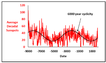
Figure 17:Radiocarbon sunspot data 1700-1900.
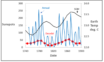
Figure 18:Radiocarbon sunspot data 100BC-100.
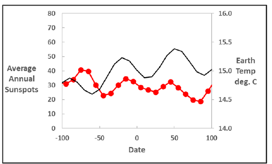
Figure 19:Radiocarbon sunspot data 1800BC-1600BC.
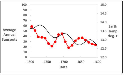
Figure 20:Radiocarbon sunspot data 2800BC-2600BC.
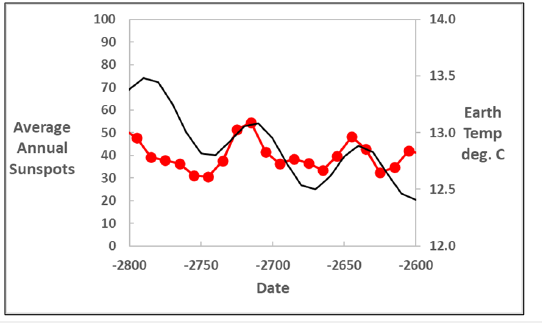
Figure 21:Radiocarbon sunspot data 3200BC-3000BC.
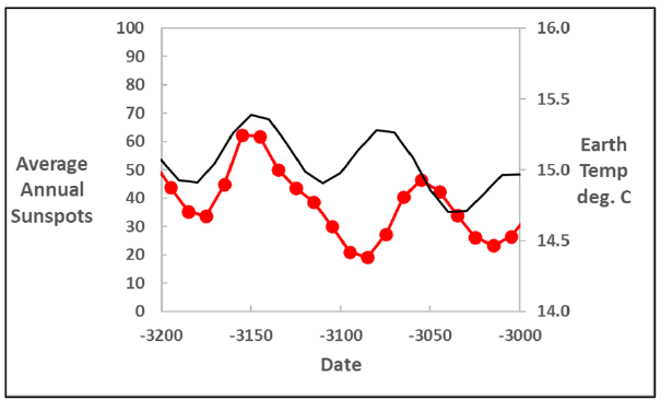
Figure 22:Radiocarbon sunspot data 6900BC-6700BC.
Cascading ice melts
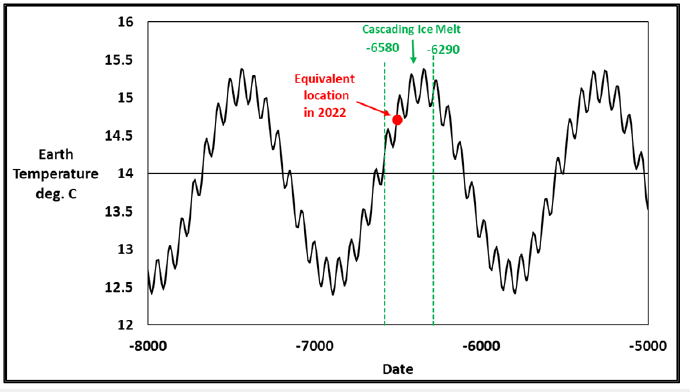
Another example of support for the SCM modeling of past Earth temperature epochs comes from a recent finding that cascading ice melts [45] from 8530BP (6580BC) to 8240 BP (6290BC) led to a localized meltwater in the North Atlantic Ocean that may have been caused by instability in the Atlantic Meridional Overturning Circulation (AMOC). This meltwater in the North Atlantic may be due to less energy transfer from a slowing AMOC even though overall Earth temperatures were still rising. Figure 23 shows that at these two times there was an Earth warming epoch according to the SCM. There should have been glacial melting during these times when there were inferred sea level rises of 14mm/yr. and 4mm/yr. compared to the usual 2mm/yr. rate. We are now at a similar time about halfway through our current warming epoch equivalently indicated in Figure 23 which may replicate this long ago past ice melt by the next maximum temperature in 2232.
Figure 23:Cascading ice melts were during a high temperature epoch.
Antarctic ice melts
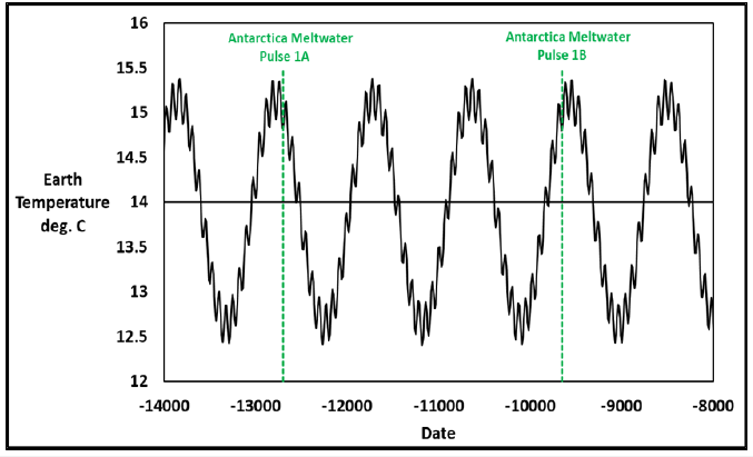
Support for the SCM modeling of past Earth temperature epochs also comes from Antarctic ice melts designated as events 1A (14,650BP or 12,700BC) [46] and 1B (11,650BP or 9,700BC) [47] where the flow of melted ice water from glaciers is believed to be the cause of increased sea levels. The timing of these events shown in Figure 24 when the melts occurred is almost exactly at an SCM maximum temperature.
Figure 24:Antarctic ice melts 1A and 1B.
Tiber river basin droughts
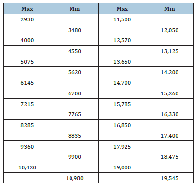
The SCM also correlates with groundwater recharge rates [48] in the Tiber River Basin of Italy with possible reaction to the AMO. Groundwater recharge rates are of concern as climate change may be affecting droughts. Figure 25 shows that the percentage of drought conditions is higher (36% and 26%) when Earth temperatures cycle above the median 14 deg. C. line and less drought (12%) as temperatures decrease toward the next minimum temperature. SCM predicts that drought conditions will increase beyond the current 26% as we approach the next maximum temperature in 2232. These five examples with extraordinarily long ago events give support to the reality of the SCM model. The SCM Earth temperature cyclicity may have been happening as long as 15,000 years ago. Solar cyclicity on other Earth phenomena such as the effect of solar activity on soil formation have been recognized [49]. There are likely other Earth science findings of very warm or very cold phenomena that may also agree with these four examples. Table 2 shows the maximum and minimum temperatures of the SCM to 20,000 years BP.
Figure 25:Atlantic multidecadal oscillation effect on drought prevalence in Italy.
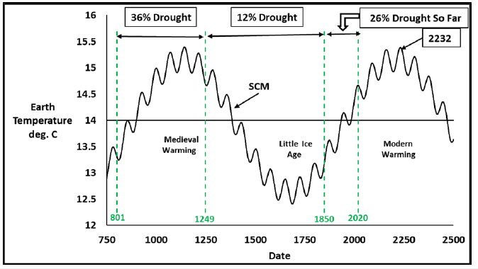
Table 2:SCM maximum and minimum temperature dates,BP.
Questionable Recalculated Earth Temperatures Since Start of the Hiatus
The UNIPCC model AR5 and the Solar Cycle Model used different calculated Earth temperatures. In fact, there appears to be no universally agreed upon calculated average Earth temperatures versus time since 1850. Figure 26 shows four calculated average Earth temperatures which differ significantly since the start of the Hiatus. Figure 26 shows that the data used by the UNIPCC AR5 model lies between two temperature profiles calculated by the Met Office Hadley Centre HadCRUT4 [50] in 2012 and HadCRUT5 [14] in 2020. Current NOAA data [51] are close to HadCRUT5. The SCM used temperature values from 1850 to 2020 from HadCRUT5 with the belief that these temperatures were valid. The curves in Figure 26 re-plotted from 1850 in Figure 27 reveal that major calculational differences appear only since about the start of the Hiatus in 1998. The calculated Hiatus temperatures initially did not agree very well with the UNIPCC AR5 model but modifications to the calculated temperature values since 1998 tend to approach that model and AR6. Figure 28 summarizes the current situation for calculated temperatures in terms of the temperature increase since 1850 compared to the calls by the greenhouse gas community to stay below a 1.5deg. C. limit.
Figure 26:Calculated earth temperatures since 1980.
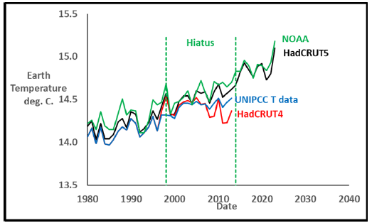
Figure 27:Calculated earth temperatures since 1850.
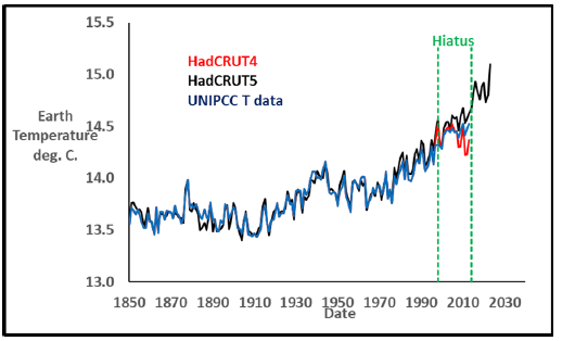
Figure 28:Differential temperature increase since 1860.
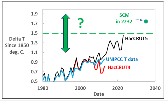
According to HadCRUT5 (and NOAA) 2023 was the hottest year on record, and the 1.5deg. C. threshold is very nearby. In contrast the SCM predicts that temperatures will rise more slowly with 1.5 deg. C. level reached in 2214, and the next maximum of 1.75deg. C. reached in 2232. The next decade of calculated temperatures will be decisive to see which of these extremely different predictions are correct with the hope that temperature calculation controversies will then be resolved. Recent changes in these Earth temperature calculation methods are controversial [52-55] with different gridding techniques, different measuring locations, and artificial increases in measured buoy temperatures [54] being some of the controversies. The Earth is over 70% water and therefore its temperature is of great importance. In 1850 temperatures were measured by sailors from buckets thrown over the side with location from celestial navigation. Since the mid-1900s temperatures have been measured in ships using sea water to cool their engines with a measured temperature slightly higher than the actual ocean temperature. Currently over 85% of measurements come from ocean buoys [54] which should give the best temperature values. Yet, measured buoy temperature values are increased to agree with the much fewer ship values measured today. With buoys giving the most accurate ocean temperatures why are their values not directly used and older ocean temperatures values lowered? Another pertinent question is what would the post 2013 calculated Earth temperatures be if the same methods and gridding used prior to that date were used for those years? Would the currently published temperature values still have dramatically increased?
No greenhouse gas explanation for higher temperatures since 2013
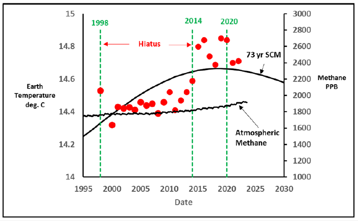
After the UNIPCC model issued in 2014 having used Earth temperature values through 2013 it was readily apparent that the model did not agree with the data since about 1998 which became known as the Hiatus. There were no sunspot maxima to account for this apparent heating and instead there was a minima, Sunspot 24, shown in Figure 29. There was also no dramatic increase in atmospheric greenhouse gas carbon dioxide [56] during this interval after the Hiatus to account for this sudden increase as shown in Figure 30. Similarly, there was no dramatic change in atmospheric methane concentration [57] in Figure 31 that might have led to increased Earth temperatures through greenhouse gas effects. Uncertainties about many aspects of the UNIPCC modeling work and the proposed greenhouse gas cause of climate change are documented in a book by a scientist [57] who had been directly involved in past climate change work at a high level. If the temperatures after 2013 are recalculated, the SCM should be reanalyzed to remove the small deviations observed to date [58,59]
Figure 29:Unexplained earth temperature increases after the hiatus – no sunspot explanation.
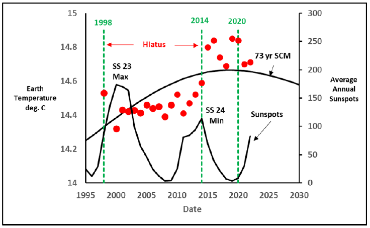
Figure 30:Unexplained earth temperature increase after the hiatus – No CO2 explanation.
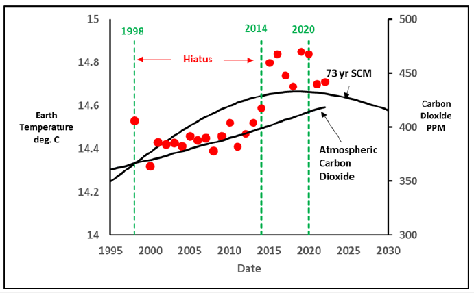
Figure 31:Unexplained earth temperature increase after the hiatus – No CH4 explanation.
What if the initial temperatures thru 2013 are correct?
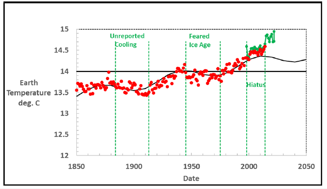
Finally, when only the 1850-2013 temperature data were used in an SCM regression fit with all red data points equally weighted, the result is shown in Figure 32. The agreement between model and data is exceptionally good and is statistically excellent in terms of residual behavior with virtually equal numbers of points above and below the line. This fit yields solar cyclicities of 1033 and 69 years. The green points are the recalculated temperatures since the start of the hiatus in 1998 with the large jump in 2014 after the end of the hiatus.
Figure 32:SCM fit without 2014-2020 measured earth temperatures.
Summary and Conclusion
The Solar Cycle Model is the best current model to understand Earth temperature changes over time. The close modeling of measured average Earth temperatures since 1850 is the first aspect of the model’s strength. The second aspect is that it closely agrees with historical epochs over the last 3,000. The third strength is that it has quantitative support from past data results from as long ago as 15,000 years. Validation of the SCM will come from agreement with future Earth temperatures and/or correct predictions for sunspots, the AMO, ACE, PDI, AMOC, PDO, and ENSO. If future Earth temperature calculations continue to be controversial the validity of correlations predictions can validate the model alone. At the very least the SCM should be considered a likely explanation for what has occurred to the Earth during this long time span and further research on it should be conducted.
The more specific conclusions reached in this work are:
A. The Solar Cycle Model closely fits past Earth temperatures
and correlates with many Earth Science correlations such that
it is the best current tool to predict future Earth temperatures.
B. The Earth is now about halfway toward its next warming
epoch maximum temperature where it will reach 15.39deg. C.
in 2232.
C. Sunspot numbers are the main driving force that
determines whether temperatures increase or decline during
local SCM downdip and upswing cycles. Sunspot cycles 25 and
26 will be minima while 27-31 will be maxima.
D. La Nina in the Pacific Ocean will dominate about 60%
of the time for the next two decades and the North Atlantic
hurricane strengths will be reduced during that interval.
References
- Nierode DE (2022) The cyclical sine mod Niño explanation for climate change. Int J Plant Animal Env Sci 12(4): 175-191.
- Nierode DE (2023) The solar cycle explanation for climate change. Journal of Ecology and Environmental Sciences 11(1): 3-6.
- Singer SF, Avery DT (2008) Unstoppable global warming-every 1500 years, Rowland & Littlefield Publishers, Maryland, USA.
- Singer SF, Avery DT (2008) Unstoppable global warming-every 1500 years, Rowland & Littlefield Publishers, Maryland, USA, pp. 15-28.
- (2014) United Nations Intergovernmental Panel on Climate Change, USA.
- Sixth Assessment Report -IPCC, Switzerland.
- Koonin Steven E (2021) Unsettled-what climate science tells us, what it doesn’t, and why it matters, BenBella Books, Texas, USA, pp. 77-96.
- United Nations Intergovernmental Panel on climate change (2014) Technical Summary, p. 37.
- Dai XG, Wang P (2018) Identifying the early 2000s hiatus associated with internal climate variability. Sci Rep 8(1): 13602.
- Bates DM, Watts DG (1988) Nonlinear regression analysis & its applications, John Wiley & Sons, New Jersey, USA.
- Papalexiou SM, Chandra Rupa, Clark MP, Lehner F (2020) Robustness of CMIP6 historical global mean temperature simulations: Trends, long‐term persistence, autocorrelation, and distributional shape. Earth's Future 8(10): e2020EF001667.
- GISS: GISS Surface Temperature Analysis (GISTEMP v4).
- Javier V (2023) Solving the climate puzzle-the sun’s surprising role, Critical Science Press, Madrid, Spain, p. 353.
- Met office Hadley centre observations datasets, HadCRUT5.
- Fred SF, Avery DT (2008) Unstoppable global warming-every 1500 years, Rowland & Littlefield Publishers, Maryland, USA, pp. 39-59.
- Ma LH (2007) Thousand-year cycle signals in solar activity. Solar Phys 245: 411-414.
- Lassen K (1991) Long-term variations in solar activity and their apparent effect on the earth’s climate, Danish Meteorological Institute, Solar-Terrestrial Physics Division, Lyngbyverj, Denmark.
- Samuel Heinrich S (1843) Observations of the sun in the year 1843, Astronomical News, pp. 233-236.
- Singer SF, Avery DT (2008) Unstoppable global warming-every 1500 years, Rowland & Littlefield Publishers, Maryland, USA, p. 17.
- Greene CA, Alex SG, Michael W, Joshua KC (2024) Ubiquitous acceleration in Greenland ice sheet calving from 1985 to 2022. Nature 625: 523-528.
- Duell Mark (2013) Thrills of the frost fair: Fascinating paintings and memorabilia show how Londoners celebrated when the river Thames froze over, Daily Mail, UK.
- Sunspot Number Data, NCEI.
- Eddy JA (1976) The maunder minimum. Science 19294245: 1189-1202.
- Eddy JA (1977) The case of the missing sunspots. Scientific American 236(5): 80-88.
- Shindell, Drew T (2001) Solar forcing of regional climate change during the maunder minimum. Science 294: 2149-2152.
- Lean JL (2018) Estimating solar irradiance since 850 CE. Earth and Space Science 5(4): 133-149.
- nasa.gov/solarcycle25/2022/07/27/solar-cycle-25-is-exceeding-predictions-and-showing-why-we-need-the-gdc-mission/
- Friis-Christiansen E, K Lassen (1991) Length of the solar cycle: An indicator of solar activity closely associated with climate. Science 254(5032): 698-700.
- Climate timeseries AMO (Atlantic Multidecadal Oscillation) index, NOAA, Colorado, USA.
- Steven EK (2021) Unsettled- what climate science tells us, what it doesn’t and why it matters, BenBella Books, Texas, USA, p. 67.
- Accumulated Cyclone Energy, HURDAT comparison table.
- Power Dissipation Index.
- AMOC definition, what is the Atlantic Meridional Overturning Circulation (AMOC)?
- AMOC monthly data.
- Nian DA, Sebastian B, Ben-Yami M, Blaschke LL, Marina H, et al. (2023) A potential collapse of the Atlantic meridional overturing circulation may stabilise eastern Amazonian rainforests. Communications Earth & Environment 4: 1-11.
- NOAA PDO.
- Mantua NJ, Hare SR, Yuan Zhang, Wallace JM, Francis RC (1997) A pacific interdecadal climate oscillation with impacts on salmon production. Bulletin of the American Meteorological Society 78(6): 1069-1079.
- Chao, Yi, Michael Ghil, McWilliams JC (2000) Pacific interdecadal variability in this century’s sea surface temperatures. Geophysical Research Letters 27(15): 2261-2264.
- Extended multivariate ENSO index, NOAA Physical Sciences Laboratory, Colorado, USA.
- Climate prediction center-ONI, USA.
- Henson B (2023) A mystery in the Pacific is complicating climate projections, Yale Climate Connections, USA.
- Chilly temperatures during the maunder minimum, NASA Earth Observatory, USA.
- Solanki SK, Usoskin IG, Kromer B, Schüssler M, Beer J (2024) Unusual activity of the sun during recent decades compared to the previous 11,000 years. Nature 431: 1084-1087.
- noaa.gov/pub/data/paleo/climate_forcing/solar_variability/solanki2004-ssn.txt
- Rush Graham, Ed Garrett, Bateman MD, Bigg GR, Hibbert FD (2023) The magnitude and source of meltwater forcing of the 8.2ka climate event constrained by relative sea-level data from eastern Scotland. Quaternary Science Advances 12: 100119.
- Yucheng L, Hibbert FD, Pippa LW, Sarah AW, Anthony P, et al. (2021) A reconciled solution of meltwater pulse 1A sources using sea-level fingerprinting. Nature communications 12(1): 2015.
- Abdul NA, Mortlock RA, Wright JD, Fairbanks RG (2016) Younger dryas sea level and meltwater pulse 1B recorded in Barbados reef crest coral Acropora palmata, Paleoceanography Paleoceanography 31(2): 330-344.
- Nazzareno D, Bellocchi G (2024) Millennium-scale changes in the Atlantic multidecadal oscillation influenced groundwater recharge rates in Italy. Communications Earth & Environment 5: 1-13.
- Ivanov LV, FN Lisetskii (1995) Ultracentanial periodicity of solar activity and soil formation. Biophysics 40(4): 905-910.
- (2012) Met office Hadley centre observations datasets HadCRUT4.
- National Centers for Environmental Information, Global Time Series, Global Time Series, Climate at a Glance, National Centers for Environmental Information (NCEI), NOAA Data, USA.
- Christopher B (2015) The fiddling with temperature data is the biggest science scandal ever, the fiddling with temperature data is the biggest science scandal ever.
- Hausfather Z (2017) Explainer: How data adjustments affect global temperature records.
- Buis Alan (2021) The raw truth on global temperature records, ASK NASA Climate, USA.
- Hausfather Z, Kevin C (2015) A buoy-only Sea surface temperature record.
- Trends in Carbon Dioxide, Global Monitoring Laboratory, Earth System Monitoring Laboratories, Carbon Cycle Greenhouse Gases.
- Global Monitoring Laboratory, Carbon Cycle Greenhouse Gases.
- Steven EK (2021) Unsettled-what climate science tells us, what it doesn’t, and why it matters, Chapter 4, BenBella Books, Texas, USA.
- Spence Katie (2024) Trillions spent on “climate change’ based on faulty temperature data, climate experts say, Epoch Times, New York, USA.
© 2024 © DE Nierode. This is an open access article distributed under the terms of the Creative Commons Attribution License , which permits unrestricted use, distribution, and build upon your work non-commercially.
 a Creative Commons Attribution 4.0 International License. Based on a work at www.crimsonpublishers.com.
Best viewed in


.jpg)


 Editorial Board Registrations
 Submit your Article
 Refer a Friend
 Advertise With Us

.jpg)





.jpg)


.bmp)
.jpg)
.png)
.jpg)


.jpg)


.png)

.png)


.png)
