- Submissions

Full Text
COJ Technical & Scientific Research
Graphical Environment for Application Interfaces Accessible by Seniors
Luiza Rosa*, Ivana Maria, Eveline Sa, Alinne Marting and Ana Rebeca Araujo
Federal Institute of Education, Science and Technology of Maranhão, Brazil
*Corresponding author: Luiza Rosa, Federal Institute of Education, Science and Technology of Maranhão, São Luís, Maran hão, Brazil
Submission: July 05, 2018;Published: July 17, 2018

Volume1 Issue1 July 2018
Abstract
Considering the growth of the population over the age of 60 years in the country and the peculiarities of this phase of life as the difficulties in handeye coordination and vision, it is essential to propose ways to get them to new technologies and improve your experience with technological advances. So, using concepts that involve the inclusive design and design thinking, this work aims to develop the graphical environment for android applications that facilitate the interaction, to reduce the interference of the difficulties in relationship with mobile applications. The quality of the interface is mister, if interactive systems are to be successful. To design high quality interfaces, it is essential that they are evaluated during the design process, to identify and adjust interaction problems. This chapter presents concepts of quality of use in interfaces and the main evaluation methods used to assess them.
keywords Cognitive ergonomics; Interface; Thinking design; Inclusive design
Introduction
The National Plan for the Rights of Persons with Disabilities: Living Without Limits Plan (Decree No. 7.612/2011 [1], contemplates four main hubs: education, health care, social inclusion and accessibility. In this segment, it is necessary to develop adaptations, of any order, that enable the social use of the capacities that people have. With this approach, assistive technology is an important tool to provide this part of the Brazilian population with the full exercise of their rights. These technologies must either expand a deficient functional ability or lead to the performance of a function that the person is unable to perform. The technologies have evolved in an indisputably significant way in recent years, contributing to the advancement of several areas and to the improvement of life and making daily activities easier. However, elderly users go through many difficulties in dealing with technology, by the computer, cell phone, etc. This happens for several reasons, which are the complex graphical interfaces and difficulties coming from the age group. The main subject of this article is to present studies about adequate development of interfaces for elderly users, looking forward to optimizing their relationship with technology and with the contemporary society. With the concepts of thinking design and inclusive design, besides orientation for designing interfaces based on ergonomic principles, this project aims to develop the graphical environment for Android applications that will make the interaction with the elderly easier and will reduce the oppositions in connection with mobile applications. Therefore, developers who want to create applications for this audience will be able to provide accessibility more conveniently. This objective is one of the targets of the Health Cation project, including this initial research, which suggest ways of controlling the health of the elderly using wearable and mobile technologies. In this research, studies are being carried out on creation of themes and styles for Android, from design to mobile applications, cognitive ergonomics and universal design to fill the gaps and barriers between the elderly and technology[2]. The project justified itself by the relevance of the theme and social intention and by the teams involved in technologies. The technical merit goes through the association of digital technology with the concepts of assistive technology and cognitive ergonomics, since the cognitive analysis is theoretical and methodological referential are extremely important in what concerns the development of an assistive and inclusive interface to the elderly, who have been forgotten in the current context of the process of integration with new technologies. Making adaptations to guarantee more accessibility for application requires more research and commitment but is a possibility that can facilitate social and health scopes to end users. Thus, it is known that by applying the foundations of ergonomic and universal design it is possible to include methodologies to reduce the gap between the elderly and new technologies.
Use of mobile devices for the third age
Mobile devices are digital technologies that allow mobility and access to the internet. Thus, examples of mobile devices: mobile phones, smartphones and PDAs (small computer with Internet access). Is equipment that provides communication features at any time? In addition, advances in processing power and connectivity of these devices, increase the potential of your use[3]. Many devices can, for example, provide information about the location of the user and allow access to the Internet. This makes them ideal for supporting a variety of daily activities, such as access to information on public transportation, and facilitates communication with other users, improving the ratio of individuals. However, there are some barriers that restrict the use of these technologies by people of the third age. The first restriction is that mobile devices are not designed for elderly people. To assist the volubility, most of them are small and have limited size keys and screen that make your operation by people with vision and motor skills with limitations. The second constraint is that operating systems these devices many times offer a variety of menus that make it difficult, even for the youngest, remember where to find the desired functionality. In addition, the menus use some common terms for those using the technology daily, but unknown to those who do not have such intimacy. One can cite the terminology “sending SMS” in place of “text messaging”. These obstacles can generate serious implications for the near future, when the access to various services will be linked solely to computerized equipment, such as occurs with the Bank services and some government services.
Usability
The concept of usability fits into any kind of interface design, having different amplitude according to the criticality of the project, that is, the more critical is the system, the greater the losses if it is not easy to use and provide satisfaction. She must be considered from the planning of the project, up to the stage of development and testing. Some typical factors involved in the concept of usability are: ease of learning, ease of use, efficiency and productivity, user satisfaction, flexibility, usefulness, security in use. The ease of learning refers to the time and effort required for users to learn to use a certain portion of the system with a certain level of competence and performance [4]. Generally, a system can be analyzed under a simple usage perspective, considering an intermediate or advanced level, for example, each requiring different types and degrees of learning. In this case, the ease of learning can be analyzed in various points, considering each passage from one level of qualification to the next. The ease of use of the system is connected not only with the cognitive effort to interact with the system, but also with the number of mistakes made during this interaction. It is important to note that an easy-to-learn system is not necessarily easy to use or vice versa. Easy-to-use systems can be inefficient in two ways: with respect to allowing the user to make, and how the user should do so. The usage efficiency factor serves to assess whether the system does that for which it is intended. Already the productivity factor serves to assess whether the user can do what he needs quickly and effectively. This factor is usually evaluated by the elapsed time from the beginning to the completion of a task and the number of steps that the user had to perform. As the acceptance of an interactive system is crucial to the success of the system, the user satisfaction factor emphasizes the subjective evaluation of the system made by its users, including emotions that arise when interacting, whether they are positive, as pleasure and entertainment, or negative, like boredom or frustration. Different people can follow different paths to reach the same goal. These idiosyncrasies range from primitive operations such as using mouse or hotkeys to trigger a system function, even troubleshooting strategies separate, as the “creative” use of a text editor software Slideshow, for example. The flexibility factor considers how a system can accommodate these idiosyncrasies. The usefulness of a system refers to how a system provides the feature set required for users to go about their task. This dimension is closely related to the concept of applicability proposed by Fischer (1998), which will be seen below. The safety dimension refers to the degree of protection of a system against unfavorable conditions or even dangerous for users. It is mainly how to avoid and allow the user to recover from error conditions with serious consequences for your work or for your health [5].
Communicability
The concept of communicability refers to the ability of users to understand the design as conceived by designers. The hypothesis underlying the concept of communicability is that if a user understands the decisions that the designer took to build the interface, increase your chances of making a good use of that system. In systems with high communicability, users can answer: so that the system serves, what is the benefit of using it, how it works and what are the General principles of interaction with the system. During the design process, the designers draws up the answers to these questions, but not always bother to properly transmit it through the interface. As a result, the user may be unable to create a mental model of the system that is compatible with the designer, which often makes the interaction a tedious exercise in trial and error. An interface with good communication skills allows the user to formulate a mental model compatible with the designer’s. The use of analogies with family artifacts to the user can contribute to this because the user already has a mental model about the behaviour of these artifacts. However, it is important to make it clear what the scope of the analogy is, i.e. whatthe portions of the mental model about the known artifactthat are can be transported to the construction of the mental model about the interface in question[6].
Characteristics of older persons in relation to the aspects of application interface
Today’s smartphones are used for the most diverse tasks of everyday life for people of various ages, among them include people of 60 years or more. The smartphone makers in the United States are attentive to this trend, but little is seen in packages of accessibility tools on smartphones in Brazil. The aging brain changes occur, these are: structural, neurochemical, neurophysiological and neurobiological. Cognitive disability-related aspects of human memory in aging processes refer to the decrease in the efficiency of the processing of the information. In memory of tasks and procedures, the decline is high according to the complexity of the task, and the time of reaction also. Due to changes arising from old age, some of the activities performed by the elderly can be hindered, among them, the interaction with technological means.
As for the interface elements have the Visual and audio aspects showed in Table 1. The main interface elements that allow user interaction of smartphone and the resulting changes of aging are related to each other in Table 2, which represents the inclusion of these factors resulting from user interaction with the elderly smartphone and its possible consequences.To facilitate in decisionmaking of designers in smartphone interface projects, Padovani and Napo drew up a theoretical-practical guide that includes design principles and other aspects such as: descriptive model, checklist and scripts for evaluation of applications and interfaces for smartphone[7]. Padovani and Napo interface exposes principles for projects, which were grouped into four categories, such as:
Table 1: Smartphone interface elements.

Table 2: Interaction between smart phone interface elements and sensory systems.
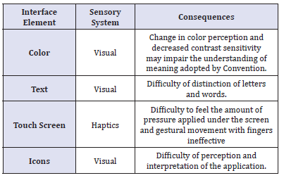
Context: A set of principles that consider the context in which the user is inserted while interacts with the smartphone, the special attention of these principles is in the dynamic environment that surrounds the user.
Customization: This category of principles values the importance of smartphone user customization, as this is a personal device, should enable the user to modify its settings, it is also important that the mobile device itself if adapted as the profile of user interaction.
Dialogue: Group of principles that seek to optimize the tasks performed on the smartphone, the emphasis of these principles is to propose a more responsive interaction and clear, especially if the feedback of the interface.
Design: The meeting of these principles suggests that the interface is efficient and pleasant to use, these principles seek to enhance the information provided by the interface and user comfort during the interaction with the smartphone. Of the four categories of principles include those considered most critical in carrying out a task using a smartphone, these principles were related to cognitive processes perception, attention and memory.
When designing an interface accessible to make which stages of cognition of the elderly a principle will be relating, in possession of this knowledge the interface designer can design an interface more accessible by lowering the load cognitive (brain power) required to perform certain task on your smartphone.Objective
The overall objective is related to the development of the graphical environment for applications that facilitate the interaction, generating social inclusion by identifying and presenting the solution to interference which makes it difficult or impossible to an elderly can enjoy that item. The goal is to contribute to the social inclusion, identifying the main difficulties seen in applications and finally, develop graphical environments, aiming at the optimization of your relationship with the technological means and, consequently, with the society contemporary.
Methodology
The methodology is a systematic review, interpretive, anchored in qualitative analysis, based on consistent scientific evidence about the usability of common elements present in certain place. Studies were carried out on ergonomics, creating themes and styles for Android, design for mobile applications, cognitive ergonomics and universal design, so that they could identify and evaluate ergonomically each element considered in barrier graphical environments.
Results
To remedy the shortcomings that informational, tend to work uniquely and to specific target audiences, it was necessary to take knowledge of the main access barriers present in the media so that it becomes possible to make the use more comfortable for the public. Second, the aging process causes a progressive reduction of anthropometric measurements and muscular forces, as well as a progressive degradation of cardiovascular function, joint flexibility, organ of the senses and the brain function. Under the optical ergonomic design, it is necessary to know the difficulties to draw effective measures capable of include the elderly in digital platforms making them aesthetically inviting spaces considering their physical needs.
One of the techniques available to conduct the evaluation of the interfaces is the technique of data collection. Among the diverse approaches of this technique, we can highlight the collection of opinion and observation of users. In the collection of the opinion of users want to identify the level of satisfaction of users with the system, if they had any difficulty while using it, if the appearance of the system is satisfactory, and others. Usually, questionnaires and interviews are used to obtain the views of users, whether in person or remotely, with small groups or larger groups. On the observation of users, evaluators can show the problems that the user faces and the positive aspects during use. The note can be registered through notes, recording or a combination of these. The environment of observation can be from the place of work, for example, or laboratories, where the observer can have greater control over the variables of the assessment, as the time duration, the tasks performed, the user’s concentration, etc.To carry out this research, it was decided to use a combination of these techniques to assess the users ‘ experience with the interfaces, and, with the result of this summative evaluation, write the guidelines for the development of future interfaces and to adapt the existing ones.
As above, the older audience has specific needs that must be met when designing interfaces for this audience so that it can use the applications with minimal difficulty and discomfort as possible. After review, the guidelines proposed by other authors, specifically of interaction with mobile devices, have been collected in the following topics, grouped according to the categories found.
Text
The text must be large, 10 pixels or more, including the texts present in form fields, and others. Must also be aligned to the left and be composed of short sentences. If possible, controls to adjust the size of the text should be made available. So that the text is properly expanded, scalable pixels must be used (sp). In addition, the spacing between the rows should be sufficient to prevent overlapping characters in case of increased user source. Although it is recommended that the text size follow the size set by the phone system and that the minimum size is 10 pixels, this is a recommendation that can be reviewed during testing with elderly users, because, despite the reduced screen of mobile devices, this size is very small considering the common vision problems.
Buttons and icons
The buttons must have clue as to your pressing. The icons must represent clearly its features, and to facilitate public interaction, the ideal is that the icons are related to the cultural context of the elderly. Size recommendations vary from 62 pixels to 78 pixels, with the same spacing between a button and another. It is recommended that smaller buttons are surrounded by white space to ensure the accuracy of the touch. Due to the divergence in the minimum size of buttons, this feature can also be evaluated during testing.
Color and contrast
How many elderly people present change in how they see the colors, their use must be combined with another form of feedback, whether textual or audible, tactile. Also, the Visual elements must have colorcontrast enough to reach a larger number of users. The contrast between the elements should be enough so that there is a clear distinction between them and the background.Following the principles of Brazilian Association of technical standards (ABNT), the size of the numbers and letters should be adequate to the viewing distance, according to 1/200. It is recommended to use the following fonts: arial, verdana, Helvetica, universe and folio, due to non-use of serifs. Letters should be used in high and low boxes to sentences, and uppercase letters for short sentences, avoiding the use of vertical text Figure 1-5.
figure 1:
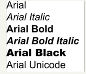
figure 2:
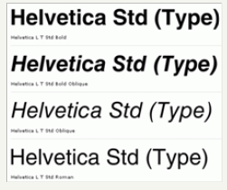
figure 3:
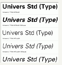
figure 4:

Thinking on the development of a website is extremely important to study and analyse the colors that will be used, because, in a way, the colors are a kind of code easy to understand and so it can be used strategically as a didactic instrument. The colours form an immediate language which has the advantage to overcome many barriers with their problems. Shape and color are basic elements for the visual communication. Some of the color effects are: create optical illusions, give impact to the recipient, improve readability and identify a product category [8].
figure 5:

The design of interfaces for Seniors should consider the rapid evolution of mobile technology and new means of interaction that it offers, such as the various types of touch, touch dual, touch long and others. Therefore, it is necessary to study this interaction to complement the set of guidelines, as this aspect is also part of the interface and the way the applications using these different types of touch affects how the elderly interact with the technology[9].
During the research phase, a questionnaire was used for these tests. This questionnaire takes place through general questions (Appendix A). The questionnaire questions should be applied after each task and has objective and subjective questions.The purpose of using this type of questionnaire is trying to obtain the maximum of information on the experience of the elderly during the tests, and hopefully get the engagement of the participants more fully possible.
figure 6:

To assess the engagement of older people with the different ring tones associated with some aspects of interface, applications were chosen Telegram and WhatsApp. The choice of these applications took place because they were visually similar in Android platform, have similar functions (focus on text messaging, voice and images) and are both free (TELEGRAM, 2017; WHATSAPP INC., 2017). In addition, WhatsApp is named as the messaging application favorite of Brazilians (Figure 6), the Telegram of the various alternatives available in the market[10].
Discussion
The elderly has some limitations, mainly in the vision, that make your navigation, is less satisfactory. Other limitations with inaccessibility sites end up making navigation in the same, thus causing a digital divide. In addition to the decreased vision, the elderly have to deal with some impediments caused by motor coordination already impaired by age, memory faults and a mild learning difficulty. Because of such facts, the sites must present an interface that has certain requirements for this transfigure into suitable for elderly users.
It is common for websites to work with fonts and colors that aren’t appropriate. Small fonts, colors whose membership compromises readability all these aspects are obstacles to Internet users. The aesthetic features, when applied in a coherent way, can also provide the interface developer means to increase usability of the user.Shape and color are basic elements for the visual communication. Some of the color effects are: give impact to the receiver, creating optical illusions, improve readability, identify a product category [8]. The colors of the text should be reviewed, considering the background of the interface, since in some circumstances the reading becomes almost impossible, because the colors are out of balance.
The user interfaces contrast and font sizes (i.e. types of letters) used in computer programs can be increased to enhance better the content and readability. Another feature that may facilitate is the screen by touch, gives the feeling to the user control over the application with which it interacts. And most important of all: simplicity. The fewer details, the better, how smaller the amount of resources available in the application, it will be more intuitive and thus easier to be your use.The investment in the aggregation of the elderly in this world surrounded by technological innovations will cause those users to use, in a timely manner, the technologies. For example, the purchase of medicines can be made through pharmaceutical sites, freeing the elderly from unnecessary locomotion.
Other benefits are also inevitable, as: mental activity that can help the elderly out of rut mentally harmful and interpersonal relationships that minimize the insulation avoiding even potential diseases.Usability assumes some importance in recent times, because, according to the digital inclusion, an avalanche of novice users joined the network, especially elderly people who are on the run from the difficulties of locomotion, urban violence and bad public spaces[11,12].
Conclusion
The elderly has been trying your inclusion in this new society in which the interaction between people occurs mainly through the internet, when many tasks, which in another period of history require your mobility aid, currently are carried out by means of e-mails, searches, clicks. A site when really follow ergonomic standards and meets the criteria of usability, makes a great contribution to the digital inclusion of elderly, positively influencing their lives, consequently generating social inclusion. Digital inclusion also provides users with the elderly means to leave the routine, which can bring the same health problems caused by isolation or mental activity. Whereas the number of people who reach old age is high, the number of Internet users aged, obviously, too. The activity of this audience in news, shopping sites and social networks is increasing, despite the difficulties that those users still face to use such tools. Soon, measures must be taken to optimize the navigation of these users over the internet. There are standards that ensure internet accessibility and criteria to allow the inaccessibility is discard, however, perhaps because of ignorance of the developers, many websites seem to decline of ergonomic criteria during construction of your interface. In this context, this work contributes to the optimization of interfaces, presenting solutions for better interaction of the elderly with new technologies.
References
- Padovani S, Napo PR (2015) Sistemas de navegação em smartphones: um guia teórico-prático de design. In Navegação em smartphones: Uma abordagem centrada no usuário (relatório final de projeto|CNPq 300641/2012-5). UFPR, Curitiba, Brazil, p. 63.
- Anjos TP (2012) Descomplicando o uso do telefone celular pelo idoso: Desenvolvimento de interface de celular com base nos princípios de usabilidade e acessibilidade. Dissertação (Mestrado)-Curso de Engenharia de Produção, Universidade Federal de Santa Catarina, Brazil, p. 179.
- Macedo MKB (2009) Recomendações de acessibilidade e usabilidade para ambientes virtuais de aprendizagem voltados para o usuário idoso. Florianópolis: UFSC. Dissertação (Mestrado)-Programa de Pós Graduação em Engenharia e Gestão do Conhecimento, Universidade Federal de Santa Catarina, Florianópolis, Brazil, p. 104.
- Adler P, Winograd T (1992) Usability: Turning technologies into tools. Oxford University Press, New York, USA.
- Cybis WA (2000) Ergonomia de interfaces homem-computador. Apostila para o Curso de Pós-Graduação em Engenharia de Produção, UFSC, Brazil.
- Bastien CS (1993) Ergonomic criteria for the evaluation of human computer interfaces. Tech Rep no 156, Institut National de Recherche en Informatique et en Automatique, Rocquencourt, France.
- Rosa JGS, Moraes A (2008) Avaliação de projetos no design de interfaces. Teresópolis, 2AB, Brazil.
- Farina M (1986) Psicodinâmica das cores em Comunicação. In: Edgard B (Ed.), São Paulo, Brazil.
- Smashing Magazine (2018) 80 Beautiful professional fonts.
- Need for Bits (2018) Install Microsoft windows fonts on ubuntu [The Ultimate Guide].
- IBGE (2018) Projeção da população por sexo e idade: Brasil 2000-2060 Unidades da Federação 2000-2030.
- Luc Devroye (2018) Walter braum.
© 2018 Luiza Rosa. This is an open access article distributed under the terms of the Creative Commons Attribution License , which permits unrestricted use, distribution, and build upon your work non-commercially.
 a Creative Commons Attribution 4.0 International License. Based on a work at www.crimsonpublishers.com.
Best viewed in


.jpg)





 Editorial Board Registrations
 Submit your Article
 Refer a Friend
 Advertise With Us
.jpg)


.jpg)


.bmp)
.jpg)
.png)
.jpg)


.jpg)


.png)

.png)


.png)


